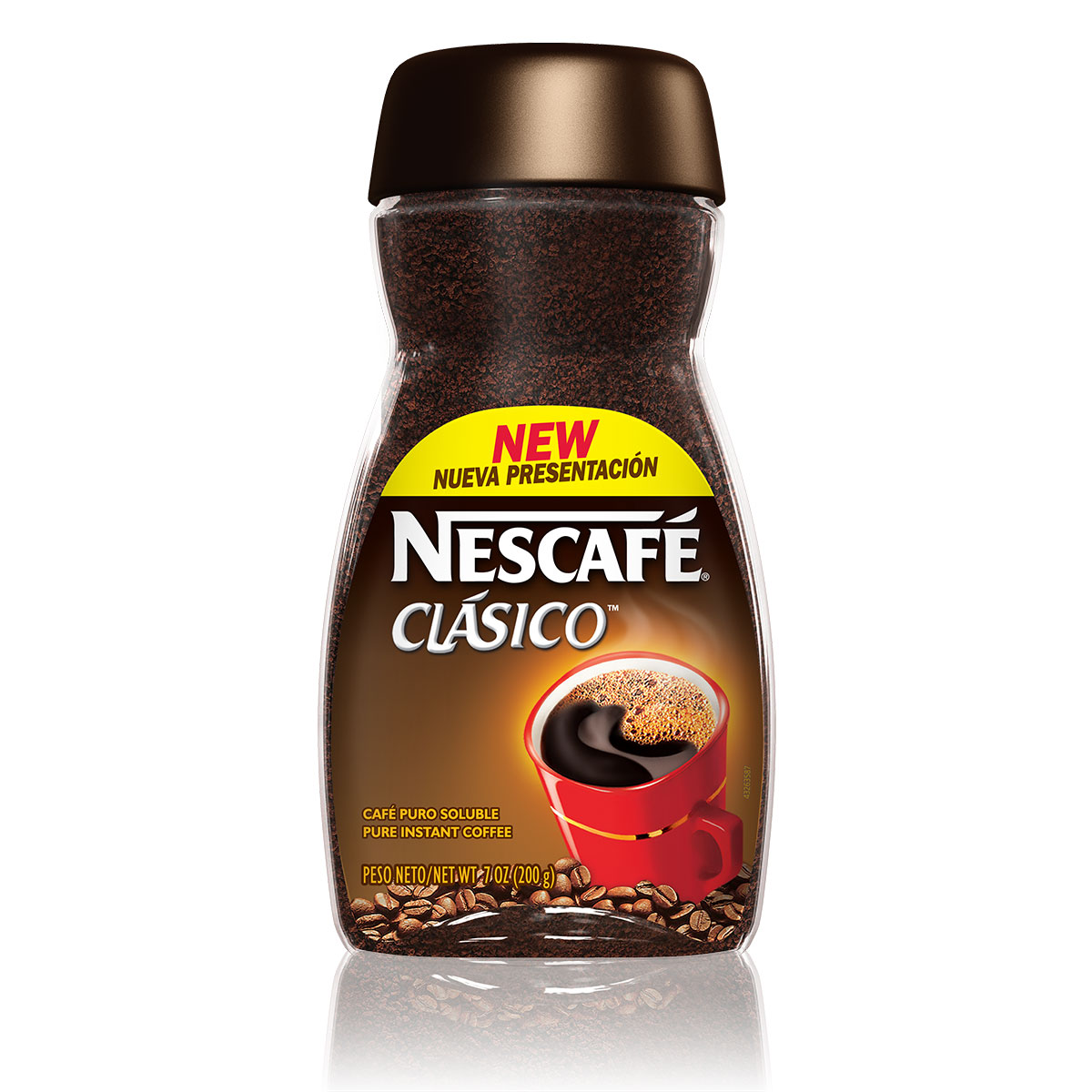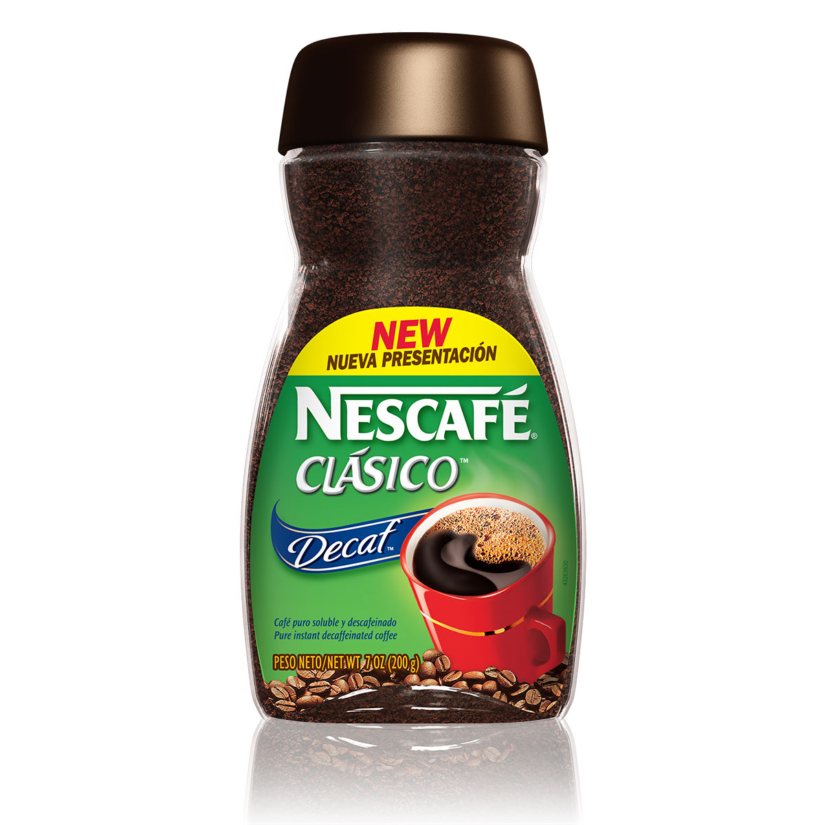


Nescafe Clasico Packaging Redesign
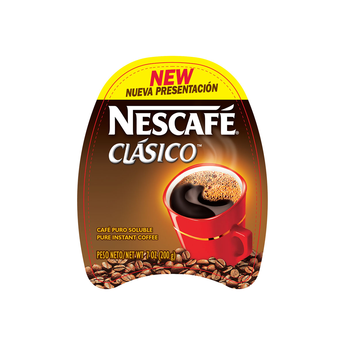
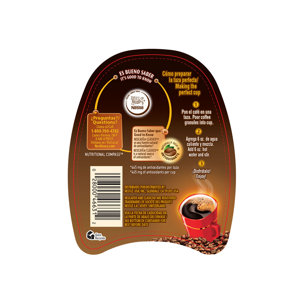
I had the incredible opportunity to work with the beverage team at Nestle, and update a beloved iconic brand. My task was to translate the Nescafe brand packaging from the original mason jar, to its new modern and sleek “dawn” jar. I also had to incorporate graphics that brought attention to its new packaging presentation. Every single aspect of this packaging was crucial, as we did not want to lose brand equity nor brand recognition with longtime Nescafe consumers. After multiple rounds with the beverage marketing team, this was the final outcome.
